I used to think a beautiful Pinterest pin was enough. Then I tested pins that looked “pretty” but earned almost no clicks. The problem was not the topic. The problem was the design. Learning how to design better Pinterest graphics changed the way I planned every pin.
Pinterest is a fast visual search platform. People scroll quickly, compare ideas instantly, and tap only when a graphic gives them a clear reason. That means every pin needs three things: readable text, strong visual focus, and a layout built for mobile.
Why Pinterest Graphics Need a Mobile-First Mindset
Most Pinterest users discover content on smaller screens, so a pin must work before anyone zooms in. If the headline is hard to read, the image is too busy, or the colors blend together, the pin loses the click.
Pinterest also recommends creating visuals that feel useful, clear, and native to the platform instead of looking like traditional ads. Strong pins usually present one idea, one promise, and one next step.
That is why I treat every Pinterest graphic like a mini landing page. It should tell the reader what they will get, why it matters, and what to do next.
Start With the Right Pinterest Graphic Size
Use the 2:3 Layout
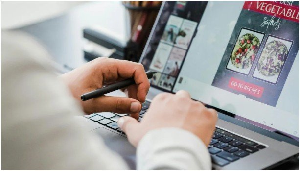
The best standard Pinterest pin size is 1000 x 1500 pixels. This follows the 2:3 aspect ratio, which gives your pin enough vertical space without making it too tall. Pinterest’s ad specs also warn that creative should avoid being obscured by interface elements and stay within visible areas.
A square image can work, but it usually takes up less feed space. A horizontal image often disappears in the scroll. A very tall pin may get cropped, which can cut off your headline, CTA, or branding.
When I design pins, I divide the canvas into three zones. The top section gets the hook. The middle gets the main image or visual proof. The lower section gets light branding or a small CTA.
Protect the Bottom Safe Zone
Never place your most important text at the very bottom. Pinterest interface elements can overlap parts of the design, especially on mobile. Keep the headline, keyword, and offer above the lower edge.
A safe rule is simple: if removing the bottom 15% of the pin ruins the message, the layout is risky.
Make Your Pin Text Easy to Read
Use Two Fonts Only
Good Pinterest typography is not about using fancy fonts. It is about speed. People should understand the pin in one glance.
I usually use one bold sans-serif font for the main headline and one simple accent font for contrast. Script fonts can look elegant, but they often fail on mobile. If someone needs to slow down to read the words, the design is already losing.
Keep the headline short. A strong pin title like “Easy Blog Graphic Tips” will usually beat a long sentence squeezed into five lines.
Highlight the Main Keyword
The fastest way to improve a pin is to make the main topic visually obvious. If the pin is about Pinterest graphics, those words should stand out.
You can highlight the keyword with a bold weight, all caps, a background box, or a contrasting color. Do not highlight everything. When every word screams, nothing stands out.
This is also where graphic design SEO and visual strategy meet. A clear headline helps the user understand the content, while the pin title and description support Pinterest search.
Use Images and Colors That Stop the Scroll
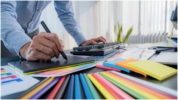
Images should support the message, not compete with it. A busy photo behind busy text creates visual noise. If I use a photo background, I often lower the contrast or add a soft overlay so the text stays readable.
A clean palette also matters. Use two or three colors: one brand color, one neutral shade, and one accent color. That keeps the design polished without making it dull.
High-resolution images are worth the extra effort. Pinterest compresses uploads, so weak images can look worse after publishing. Start with crisp visuals and export your final graphic as a high-quality PNG or JPEG, depending on your workflow.
Add Branding Without Making the Pin Look Like an Ad
Branding should be visible, not loud. A small logo, website URL, or brand mark near the top or bottom can build recognition over time.
The mistake I see often is making the logo bigger than the promise. People do not click because a logo is large. They click because the pin solves a problem.
Keep the design consistent across your pins. Use similar fonts, spacing, colors, and image style. Over time, people start recognizing your content before reading your name.
If you already create blog visuals, connect your pin style with your on-site graphics. This makes the experience feel smooth after the click. You can also improve your design system by learning how to make blog graphics look professional.
Turn Pretty Pins Into Clickable Pins
A pretty pin attracts attention. A clickable pin creates action.
The CTA does not need to be aggressive. Simple phrases work well, such as “Read the Tips,” “Get the Checklist,” or “Click to Learn.” Pinterest’s own lower-funnel creative advice favors clear copy over clever copy, especially when the user needs to understand the offer quickly.
Match the CTA to the content. A blog post can use “Read More.” A freebie can use “Download Free Guide.” A tutorial can use “See the Steps.”
Do not promise what the page does not deliver. Misleading pins may get clicks once, but they hurt trust and engagement later.
My 3-Second Pinterest Graphic Test
Before I publish a pin, I zoom out until it looks small on my screen. Then I give myself three seconds to answer four questions.
Can I read the headline?
Do I know what the pin is about?
Does one element stand out first?
Is there a clear reason to click?
If the answer is no, I simplify. I remove extra words, increase contrast, enlarge the headline, or move the focal image higher.
This test is simple, but it catches most design mistakes. It also reflects how people actually use Pinterest. They do not study every pin. They scan, judge, and tap fast.
FAQs
1. What size should Pinterest graphics be?
Pinterest graphics should usually be 1000 x 1500 pixels with a 2:3 aspect ratio.
2. How do I make Pinterest pins look professional?
Use clean fonts, strong contrast, high-quality images, consistent branding, and enough negative space.
3. How much text should a Pinterest pin have?
Keep text short, clear, and easy to read on mobile; one strong headline works best.
4. Why should I learn how to design better Pinterest graphics?
Learning how to design better Pinterest graphics helps your pins look clearer, earn more clicks, and support stronger blog traffic.
Final Swipe of Sass
A Pinterest pin does not need to be loud to get noticed. It needs to be clear, sharp, and useful. The best designs make people understand the value before they even think about clicking.
My best tip is this: design for the smallest screen first. If your pin works there, it can work almost anywhere. Start with one clean template, test your headline, protect your spacing, and let every design choice earn the click.