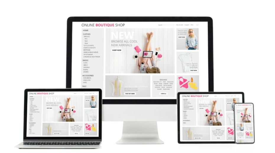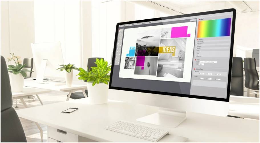
I used to think good graphics meant using better fonts, prettier colors, and sharper images. Then I noticed something awkward. My best-looking designs still felt disconnected when placed together on a blog, Pinterest board, and social feed.
That is when I started learning how to make graphics consistent across content without making every design look boring. The real trick is not copying the same layout forever. It is building a visual system that makes every graphic feel like it belongs to the same brand.
Why Graphic Consistency Matters
Consistent graphics help readers recognize your content before they even read your name. That matters because people scroll fast, compare options quickly, and trust brands that look organized.
Google also recommends creating helpful, reliable, people-first content instead of content made only for rankings. A clean visual experience supports that goal because it helps readers understand your message faster.
When your blog images, Pinterest pins, social posts, and email graphics all follow one style, your content feels more professional. It also saves time because you stop redesigning from scratch every day.
Start With a Simple Brand Style Guide
A brand style guide does not need to be complicated. Mine works best when it fits on one page. The goal is to make design choices once, then reuse them everywhere.
Choose a Core Color Palette
Pick three to five colors and assign each one a job. For example, one color can be used for backgrounds, one for headings, one for buttons, and one for accents.
Avoid choosing colors only because they look nice. Think about contrast, readability, and mood. A finance blog may need clean, calm colors. A creative blog can handle brighter accents.
Canva recommends brand guidelines and templates to help teams keep visual identity consistent across designs.
Use Two or Three Fonts Only
Too many fonts make graphics look messy. I usually use one font for headings, one for body text, and sometimes one accent font for short words.
Keep the same font sizes across similar content. If your blog graphics use a 42 px title, do not randomly use 28 px on the next one unless the layout needs it.
Keep Logo and URL Placement Predictable
Your logo should not jump around in every design. Place it in the same corner or same lower area whenever possible.
This small rule makes your content look planned. It also helps when your graphics are shared outside your website.
Use Templates Without Making Everything Look Repeated
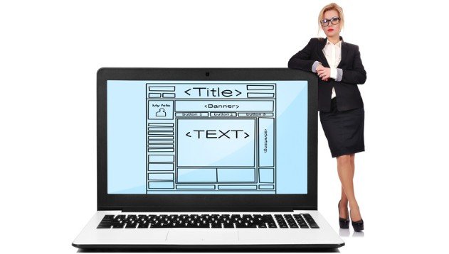
Templates are the easiest way to learn how to make graphics consistent across content while still creating fresh visuals.
I use templates like design “families.” One template may be for blog featured images. Another may be for Pinterest pins. Another may be for quote graphics.
Build Templates by Content Type
A blog featured image needs a clear title and strong layout. A Pinterest pin needs vertical space, bold text, and a strong visual hook. A social quote may need fewer words and more breathing room.
If you are creating pins often, connect this system with to design better Pinterest graphics so your Pinterest visuals stay branded but still clickable.
Lock the Parts That Should Not Change
The parts that stay fixed should include fonts, margins, logo position, colors, and text hierarchy. The parts you can change include images, headline wording, background texture, and accent shapes.
Adobe Express supports locked templates and shared brand kits, which helps teams keep colors, fonts, and layouts approved across content.
Keep Layouts Visually Related
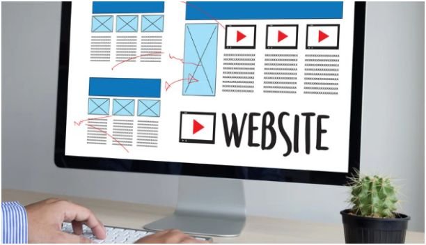
A consistent layout does not mean every image must look identical. It means every design follows the same design logic.
Use the Same Margins and Spacing
Spacing is one of the fastest ways to spot amateur graphics. If one design has tight text and another has wide spacing, the brand feels unstable.
I use a simple spacing rule. Text should never touch the edge, and every design should have enough blank space around the main message.
Follow a Grid
A grid keeps titles, images, shapes, and logos aligned. You do not need advanced design software for this. Canva, Adobe Express, and Figma all make alignment easier.
Grid-based design also helps mobile readability. Since many US readers view content on phones, your text must stay readable on small screens.
Match Your Image Style

Image style can break consistency faster than color. A soft lifestyle photo, a 3D icon, a cartoon illustration, and a dark stock image may all look good alone. Together, they can feel random.
Choose one main image direction. You can use photography, flat illustrations, line icons, or textured graphics. Just avoid mixing too many styles in one content series.
Use the Same Editing Feel
If you use photos, keep brightness, contrast, and filters similar. If you use illustrations, keep line weight and detail level similar.
This gives your content a recognizable mood. It also makes older and newer posts feel connected.
Create a 3-Second Recognition Test
Here is the original test I use before publishing. I place five graphics from the same brand side by side. Then I look away and glance back for three seconds.
If they feel like one brand, the system works. If one graphic looks like it came from another website, I check these details first:
Color, font, spacing, image style, logo placement, and headline size.
This test is simple, but it catches problems fast. It also helps when several people create graphics for the same site.
Common Mistakes That Make Graphics Look Inconsistent
The biggest mistake is changing the design mood too often. One week the graphics look minimal. The next week they look bold and neon. That confuses readers.
Another mistake is using templates without rules. A template only helps if colors, fonts, and spacing stay controlled.
The third mistake is designing each platform separately. Your blog, Pinterest, Instagram, and email graphics should not look like four different brands.
Tools That Help Maintain Brand Consistency

Canva Brand Kit is useful for saving logos, colors, fonts, and branded templates in one place. Canva says Brand Kit helps maintain consistency across brand collateral and touchpoints.
Adobe Express is helpful when teams need approved brand assets, shared libraries, and locked templates. Adobe also explains that brand kits make assets easier to access while designing.
Figma works well if you need a more advanced design system. You can create reusable components, spacing rules, and layout frames for multiple content formats.
How To Make Graphics Consistent Across Content Without Losing Creativity
The best brands do not remove creativity. They control the foundation.
Think of your visual system like a room. The walls, flooring, and lighting stay consistent. The furniture, artwork, and seasonal details can change.
That is how to make graphics consistent across content without making every post look copied. Keep the structure steady. Change the creative details carefully.
FAQs
1. How do I keep graphics consistent across platforms?
Use the same colors, fonts, logo placement, spacing, and image style across blogs, Pinterest, email, and social media.
2. What should be included in a graphic design style guide?
Include colors, fonts, logo rules, image style, icon style, spacing, templates, and examples of correct usage.
3. How many fonts should I use in branded graphics?
Use two or three fonts at most so your graphics stay clean, readable, and easy to recognize.
4. How to make graphics consistent across content for beginners?
Start with one color palette, two fonts, fixed margins, and reusable templates for each content type.
The Final Glow-Up
Consistent graphics are not about making every design look the same. They are about making every design feel connected.
Start with one style guide, one template set, and one quick recognition test. Then improve as you publish. Your content will look cleaner, your brand will feel stronger, and your readers will notice the difference before they read a single word.