


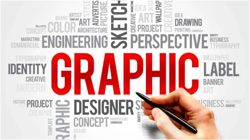
Text can ruin a great graphic faster than a bad image choice. I have made designs that looked beautiful at first, then failed the moment I viewed them on a phone. That is why learning how to make text readable on graphics matters for blog images, Pinterest pins, ads, banners, social posts, and website visuals.
Start With Contrast Before Style
The first rule of how to make text readable on graphics is simple: contrast beats decoration. If the letters and background sit too close in brightness or color, the viewer has to work harder. Most people will not work harder. They will scroll.
The Web Content Accessibility Guidelines recommend a minimum contrast ratio of 4.5:1 for regular text and 3:1 for large text. WCAG is the global accessibility standard maintained by W3C, and its contrast guidance is still the safest baseline for readable digital design.
Use the 4.5:1 Contrast Rule
I use this rule before I judge any font choice. White text on a pale sky may look soft, but it often fails readability. Black text on a dark product photo can fail too.
The fix is not always changing the text color. Sometimes the smarter move is darkening the image, adding a tint, or placing text over a cleaner area.
Test the Graphic on Mobile
A graphic that reads well on a laptop can fall apart on a phone. I shrink every important design to mobile size and check the headline from arm’s length.
If I cannot read the message in three seconds, the design is not ready.
Use Overlays, Gradients, and Text Strips

Overlays are one of the fastest ways to improve text visibility. Nielsen Norman Group also recommends improving contrast when placing text over images, especially when the image has visual detail behind the words.
Add a Full Tint Layer
A full tint layer covers the entire image with a semi-transparent color. I usually use black, navy, brown, or another dark shade that fits the brand.
Keep the overlay strong enough to calm the image, but not so strong that the photo loses meaning.
Use a Scrim Gradient
A scrim gradient is more subtle. It fades from transparent to semi-opaque behind the text. This works well for hero banners, quote graphics, blog thumbnails, and Pinterest pins.
The gradient lets the image stay visible while giving the words a clean landing space.
Place Text on a Strip
A text strip is a solid or semi-transparent rectangle behind the text. It may look simple, but it works.
Use it when the background has faces, patterns, products, furniture, plants, streets, or other busy details. A strip gives the text its own space.
Fix the Background Before Blaming the Font

Many designers change fonts when the real problem is the image. A busy background can destroy even a good typeface.
Reduce Exposure
Lower the brightness or exposure by 20% to 30% when using white text. This small change often makes the headline sharper without making the image look dull.
For dark text, do the opposite. Lighten the background area behind the words.
Blur Busy Areas
Blur helps when the image has sharp lines behind the letters. I use it on backgrounds with bookshelves, city scenes, patterned fabric, plants, or detailed interiors.
Do not blur the entire image every time. A soft local blur behind the text usually looks cleaner.
Use Negative Space
Negative space is the quiet area inside an image. It may be a clear sky, plain wall, empty table, floor space, or clean product background.
Placing text inside negative space is one of the easiest ways to make text readable on graphics without over-editing.
Choose Typography That Survives the Image
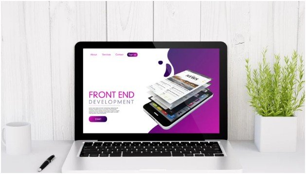
Typography has to work under pressure. Thin fonts may look elegant on a plain canvas, but they often disappear over photos.
Adobe explains that typography tools often involve adjusting font characteristics like kerning, tracking, and leading, which directly affect how text appears in design layouts.
Increase Font Weight
Use medium, bold, heavy, or black typefaces for headlines. Avoid ultra-light fonts on photo backgrounds.
If the design needs elegance, use contrast through layout, spacing, and color instead of choosing a fragile font.
Add Soft Shadows
A subtle drop shadow can separate letters from the background. Keep it soft, low-opacity, and close to the text.
Avoid harsh shadows. They can make the design look cheap and dated.
Adjust Tracking and Line Height
Slightly increase tracking when text sits on a busy background. This gives each letter more breathing room.
For multi-line text, increase line height enough to stop lines from crashing into each other. Readable text needs space.
My Three-Second Readability Test
Before exporting, I use this quick test:
Read the graphic at full size. Then read it at phone size. Then glance at it for three seconds. If the main message is still clear, the graphic passes.
This test catches common problems: weak contrast, tiny text, messy backgrounds, cramped spacing, and over-designed fonts.
Keep Readability Consistent Across Content
Readable graphics should not feel random from post to post. Use the same headline style, overlay strength, spacing rules, and color contrast standards across your content.
This also supports how to make graphics consistent across content, especially when creating blog images, Pinterest graphics, social posts, and branded templates.
A simple rule helps: create one readable text style for dark images, one for light images, and one for busy images. That saves time and keeps your visuals polished.
FAQs
1. How do I make text stand out on a busy background?
Use a dark overlay, blur the background, add a text strip, or move the text into negative space.
2. What color text is easiest to read on graphics?
White text works best on dark backgrounds, while black or dark text works best on light backgrounds.
3. Should I use shadows on text over images?
Yes, but keep shadows soft, subtle, and low-opacity so they improve readability without looking harsh.
4. Why does my text look readable on desktop but not mobile?
The font may be too small, too thin, too cramped, or placed over a background with weak contrast.
Final Take: Make the Text Do Its Job
A graphic is not finished because it looks pretty. It is finished when the message lands fast.
The smartest way to master how to make text readable on graphics is to design for the smallest screen first. Add contrast, calm the background, use stronger typography, and test the message before publishing.
Pretty graphics get attention. Readable graphics get results.