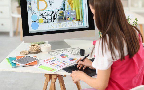
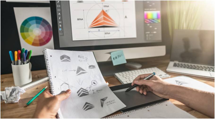
A layout can look “almost right” and still feel awkward. I learned this the hard way while designing blog graphics, where one oversized image or bold headline could make the whole page feel tilted. That is why learning how to create balanced graphic design layouts matters so much. Balance helps your design feel clear, stable, and easy to read.
Graphic design balance is not about making both sides identical. It is about controlling visual weight so the viewer’s eye moves through the layout without confusion. Nielsen Norman Group explains that visual hierarchy guides attention through size, contrast, color, and grouping, which directly affects how people understand a page.
What Balance Means In Graphic Design
Balance means distributing visual weight across a design so no area feels accidentally heavy or empty. Every image, headline, icon, color block, button, and blank space has weight.
A large photo feels heavier than a small icon. A dark box feels heavier than a pale background. Bright red pulls more attention than soft gray. A detailed texture feels heavier than a flat shape. Once I started seeing layouts this way, design became easier to fix.
Understand Visual Weight Before Moving Elements
The fastest way to improve a weak layout is to stop asking, “Does this look pretty?” and ask, “Where does my eye go first?”
Size, Color, Value, And Texture
Size is usually the strongest weight signal. A large image or headline will dominate the page unless something else balances it.
Color also changes balance. Warm, bright, and saturated colors feel heavier than cool or muted colors. Value matters too. Dark elements carry more weight than light ones. Texture adds another layer because detailed patterns create visual noise.
The Squint Test I Use
I use a simple squint test before finalizing any layout. I zoom out, squint slightly, and check which blocks still stand out. If one corner feels too loud, I reduce its size, lighten the color, add white space, or place another supporting element nearby.
This small test helps me catch imbalance faster than staring at the design normally.
Choose The Right Type Of Design Balance
Different projects need different balance styles. A law firm website should not feel like a music festival poster. A social media carousel should not feel like a bank statement.
Symmetrical Balance For Trust
Symmetrical balance mirrors elements around a center line. It feels formal, calm, and reliable. I use it for certificates, service pages, pricing sections, and professional banners.
It works well when the design needs authority. The risk is boredom, so I usually add interest through typography, subtle icons, or contrast.
Asymmetrical Balance For Modern Layouts
Asymmetrical balance uses different elements with equal visual weight. A large light image on one side can balance a small bold headline on the other.
This is my favorite method for blog graphics, landing pages, and social posts. It feels more natural and less stiff. The key is control. If one side has a large visual object, the other side needs enough contrast, text weight, or spacing to hold attention.
Radial Balance For Centered Focus
Radial balance places elements around a central point. It works well for logos, badges, charts, infographics, and circular layouts.
I use radial balance when the middle of the design must become the main attraction. It naturally pulls the viewer inward.
Build Layouts With Grids, Not Guesswork
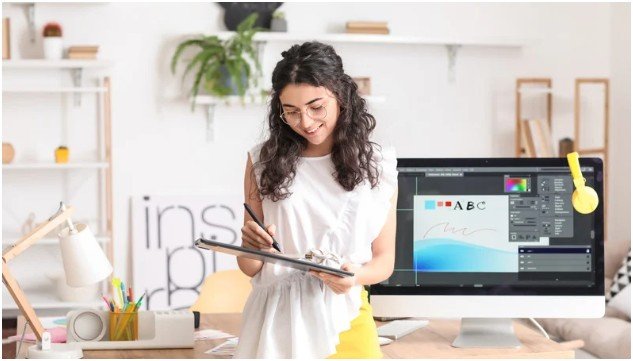
Grids are not design cages. They are invisible support systems.
A 12-column grid is common in web design because it gives flexibility for text, images, cards, and sidebars. For simple graphics, even a 3-column or 4-column grid can make spacing feel cleaner.
When I design without a grid, small alignment mistakes pile up quickly. With a grid, the design feels intentional even before colors and fonts are added.
Use White Space As A Balancing Tool
White space is not wasted space. It is breathing room. It separates ideas, reduces clutter, and gives important elements more power.
If a layout feels crowded, I do not always remove content first. I adjust margins, line spacing, and section gaps. Better spacing often fixes the problem.
For a deeper breakdown, learn to use white space in graphic design and apply those spacing ideas before adding more decorative elements.
Create One Strong Focal Point
A balanced layout needs a clear winner. If every element shouts, the viewer hears nothing.
I usually choose one hero element before designing. It may be a headline, product photo, call-to-action, statistic, or illustration. Everything else supports it.
Nielsen Norman Group notes that scale, visual hierarchy, balance, contrast, and Gestalt principles improve both beauty and usability when applied correctly.
Apply The Rule Of Thirds For Natural Balance
The rule of thirds divides a layout into a 3×3 grid. Placing important elements near the intersections often creates a more natural composition than centering everything.
I use this when a design feels too static. Moving the focal point slightly off-center can make the layout feel more alive without making it messy.
Balance For Readability And Accessibility
A layout is not balanced if people cannot read it. Contrast plays a big role here.
The W3C Web Content Accessibility Guidelines recommend at least a 4.5:1 contrast ratio for normal text and 3:1 for large text. I check contrast before publishing because low-contrast text may look stylish but fail real readers.
Good balance should support clarity. It should not hide the message behind trendy design choices.
Common Layout Balance Mistakes To Avoid
One common mistake is placing too many heavy elements in one area. A dark image, bold headline, and bright button stacked together can overpower the page.
Another mistake is treating white space like leftover space. Empty areas should feel planned, not accidental.
I also avoid using too many fonts, colors, or competing shapes. Variety can help, but too much variety breaks unity.
A Simple Example Of A Balanced Layout
Imagine a blog header with a large image on the left and text on the right. If the image is dark and detailed, the right side needs enough strength to compete.
I would use a bold headline, a short subheading, and a clear button. Then I would add generous space around the text so it does not feel cramped. If the image still feels too heavy, I may lighten it, crop it tighter, or reduce its size.
That is how to create balanced graphic design layouts in a practical way. You adjust weight until the design feels steady.
Quick Balance Check Before Exporting
Before I export any design, I ask four questions:
Does my eye know where to go first?
Is one side too visually heavy?
Do spacing and alignment feel consistent?
Can someone read the design quickly on mobile?
If the answer is no, I fix the structure before changing colors or effects.
FAQs
1. How do beginners create balanced layouts?
Start with a grid, choose one focal point, use enough white space, and balance large elements with smaller high-contrast elements.
2. What is visual weight in graphic design?
Visual weight is how heavy an element feels based on size, color, darkness, texture, and placement.
3. Is asymmetrical balance better than symmetrical balance?
Not always. Symmetrical balance feels formal and stable, while asymmetrical balance feels modern and dynamic.
4. How to create balanced graphic design layouts for social media?
Use one main image or headline, keep margins consistent, avoid overcrowding, and test the design at mobile size.
Final Touch: Make The Layout Behave
Great balance should feel quiet. The viewer should not notice the grid, spacing, or weight adjustments. They should simply understand the message faster.
My best tip is simple: remove one thing before adding one thing. Balanced design often comes from restraint, not decoration. Once the layout feels calm, clear, and easy to scan, you are ready to publish.