


Typography often seems like a small design detail until one font change dramatically improves user engagement. Choosing the best fonts for modern web design can influence readability, trust, and how long visitors stay on your website.
The right typeface creates a polished look while making content easier to scan across every device. In this guide, you will discover the best fonts for modern web design, along with practical tips to create a fast, stylish, and user-friendly website experience.
The Absolute Critical Need for Modern Typography
Imagine wearing a premium Italian tuxedo with a pair of muddy neon running shoes. That is exactly what happens when you build a stunning, high-performance website but pair it with a boring, unreadable system font from 1995.
Your typography is the literal voice of your digital interface, and using the best fonts for modern web design ensures your brand sounds sharp, professional, and sophisticated.
The Absolute Kings of Interface Readability
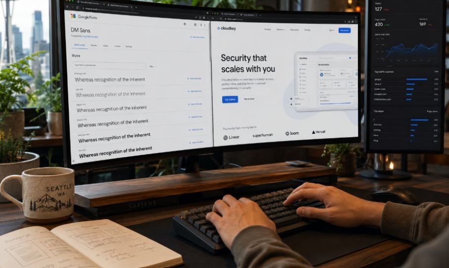
The foundational step to outstanding layout creation starts with selecting crisp typefaces built specifically for computer and telephone screens. The best modern web fonts combine clean geometry with high digital legibility.
Top choices include Inter for crisp UI, Poppins for friendly, round headings, and Playfair Display for elegant serif accents. You can easily integrate and test these via Google Fonts. Choosing the right modern font depends on your site’s tone, industry, and whether you are focusing on headings or body text.
Inter
Inter is a consensus-favorite for web design, particularly in UI and tech domains. It was meticulously crafted for computer screens, offering excellent legibility in both massive headings and dense paragraphs. The neutral structure allows it to adapt to almost any design system beautifully.
Poppins
Poppins is a modern geometric sans-serif favored for its friendly, circular aesthetic. As discussed by web designers, it works beautifully for creative agency sites and portfolios, though its playful nature may not fit heavily corporate brands. The geometric curves add a soft, human touch to digital real estate.
Montserrat
Montserrat is an ideal heading and display font that evokes mid-century modern urban typography. Because it is wide and geometric, it stands out perfectly in bold weights, though it is usually recommended to avoid it for long, small paragraphs. It gives website landing pages an undeniable architectural strength.
Playfair Display
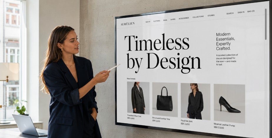
Playfair Display is a modern serif that brings luxury, editorial elegance to a website. Designers often use this for high-end fashion, food, or lifestyle blog headers, paired with a highly legible sans-serif for the body. The high-contrast letterforms look incredibly high-end.
DM Sans
DM Sans is a geometric sans-serif that looks exceptionally clean on high-resolution displays. It is heavily used for startups and modern SaaS websites because of its approachable yet highly professional feel. It remains perfectly stable at micro-sizes on mobile screens.
Technical Speed Performance Secrets Revealed
Most popular styling articles completely forget that loading heavy font files absolutely destroys your core web vitals and search engine rankings.
Switching to Variable Files
Traditional web styling required downloading separate files for bold, italic, and regular text layouts which caused massive server lag. Modern variable options pack every single imaginable weight into one ultra-slim digital file that downloads almost instantly.
Mastering Local System Stacks
Smart developers utilize native device typography configurations like San Francisco for Apple users and Segoe UI for Windows systems as an instant fallback layer. This advanced approach ensures your webpage structures render instantly before the custom elements even finish downloading.
Creative Pairing Systems for Maximum Contrast
Establishing a clear visual hierarchy means your readers naturally glide from giant title elements straight down into the main reading paragraphs.
Playfair Display with Lato
Marrying an elegant, high-contrast serif heading like Playfair Display with an ultra-minimalist sans-serif body font like Lato creates an immediate sense of authority. This specific combination dominates modern editorial and literary layouts because it feels deeply artistic.
Poppins with Open Sans
Blending a friendly, circular header typeface with an open, highly legible neutral body font creates a welcoming digital ecosystem. Web agencies frequently deploy this pairing to capture an accessible, trustworthy vibe that respects strict accessibility standards.
Best Fonts For Modern Web Design Implementation

Applying typography choices correctly inside real development environments takes a structured approach to prevent layout shifting.
Staging your CSS architecture requires declaring your custom variable families inside the global root folder to allow instant site-wide loading. Next, developers must configure specific responsive fluid scaling rules using viewport width units so letters resize smoothly across device frames.
Finally, always apply the text-rendering optimize Legibility property within your style sheets to ensure every letter shape displays with maximum sharpness. This technical step eliminates pixelation and ensures an ultra-smooth reading journey for every visitor.
Frequently Asked Questions
1. What’s a good modern font for websites?
Inter remains the absolute gold standard for clean, modern website layouts because it provides incredible legibility on small phone viewports. It offers beautiful variable weight options and matches almost any contemporary tech or business brand aesthetic effortlessly.
2. What is Gen Z’s favorite font?
Gen Z deeply resonates with expressive, retro-futuristic display fonts like Satoshi and Space Grotesk. They favor layouts that mix clean, minimalist structures with nostalgic, slightly quirky geometric shapes that break traditional corporate design rules.
3. What is the trend in font in 2026?
The dominant 2026 typography trend focuses heavily on smooth, rounded neo-grotesque typefaces and high-performance variable font files. Brands are abandoning sharp, rigid lettering for softer, organic character paths that feel universally welcoming and inclusive.
4. What font looks good on a website?
Plus Jakarta Sans looks phenomenal on modern layouts due to its bright, spacious design. Any font with a tall x-height and generous open counters will look clean, professional, and readable across digital screens.
Your Ticket to Typographic Glory
Nailing the best fonts for modern web design boils down to blending undeniable visual style with lightning-fast technical execution. Elevate your layouts today by deploying lightweight variable typefaces that load instantly, match your brand voice, and keep human eyes glued to the screen.