

Staring at a blank screen wondering how to piece your next big web project together can feel pretty overwhelming. Navigating the world of user interface design often brings you across a ton of conflicting advice about which apps to use.
Learning how to design website in photoshop remains an incredible foundational skill that gives you ultimate control over your pixels, layouts, and asset creation before handing things off to a developer.
Setting Up Your Digital Canvas
Starting your web design journey with the wrong document settings is like building a house on a shaky foundation. Getting your canvas right ensures your visual layout translates beautifully to real-world desktop web browsers.
Establishing Desktop Sizing Dimensions
Open your desktop application and click on File then select New to bring up your document creation panel. Type in an exact width of $1920\text{px}$ to match standard modern desktop screens while setting your vertical height to $2000\text{px}$ or more to allow for plenty of downward scrolling space.
Set your resolution to exactly $72\text{ PPI}$ and lock your color settings into RGB mode because these options are the strict native standards for digital display monitors. This setup guarantees that the colors and shapes you see on your editing screen look identical to what your users experience live on the web.
Preparing the Workspace Performance Profile
Managing a massive web mockup file requires that your workspace remains highly organized and lag free as you add layers. Head over to your performance preferences to allocate enough memory to handle large multi-layered graphic documents smoothly.
Keep your background color set to a clean neutral tone so that your website color palette stands out without causing eye strain during long design sessions. This simple workspace preparation keeps your system running fast and your focus entirely on the creative composition.
Mapping Your Interface Layout Grid
Great design looks incredibly effortless because it relies on hidden mathematical alignments that guide the viewer’s eyes naturally. Utilizing guides prevents your elements from drifting around randomly.
Activating the Alignment Rule System
Bring up your layout rulers instantly by hitting Cmd plus R on a Mac or Ctrl plus R on a Windows PC to see your workspace measurements. Click and hold directly on the left-side vertical ruler then drag your cursor inward to drop precise guide marks onto your canvas.
Create a balanced $1200\text{px}$ centralized safe content zone by placing your boundary lines evenly from the outer edges of your $1920\text{px}$ document space. This boundaries practice guarantees that your primary messaging and core navigation stay perfectly visible even if a visitor views your site on a smaller laptop screen.
Sectioning Creative Component Blocks
Horizontal guide lines act as your visual roadmap for breaking the web page down into logical, digestible story segments. Drag horizontal lines down from the top ruler to establish the physical boundaries for your header navigation menu, your primary hero display area, the main text body section, and your final footer base.
Segmenting your layout vertically like this makes it incredibly simple to place your design elements accurately without guessing where a section starts or ends. This blueprint framework sets a clear visual rhythm that makes your mockup look incredibly polished and professional.
Typography Patterns and Imagery Elements
With your structural guides locked firmly in place, you can finally start bringing the look and feel of your brand to life. This phase is where you combine text, shapes, and imagery into a cohesive interface.
Drawing Layout Blocks and Navigation Bars
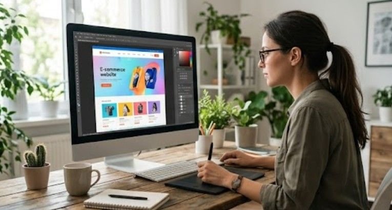
Select your standard Rectangle Tool by tapping the U key on your keyboard to begin blocking out major layout sections. Draw your main navigation strip across the very top header guide zone, filling it with a clean solid color that establishes your primary brand identity right away.
Stick to a strict, minimal palette of two to three complementary colors across your entire mockup document to keep the overall look cohesive and premium. This restraint prevents your design from looking cluttered and keeps the focus entirely on the product message.
Styling Typography with Strict Visual Hierarchy
Tap the T key to activate your Type Tool and begin placing your primary marketing headlines inside the hero section of the mockup. Use a clean, universally readable digital font at a large sizing like $46\text{pt}$ for main headings, dropping down to $16\text{pt}$ for your informational descriptive body text blocks.
Maintaining a consistent typographic scale across your pages signals to the reader exactly which pieces of information are most critical. Proper spacing between your text lines ensures that your copy feels light, spacious, and inviting to read.
Embedding Media Assets via Clipping Masks
Bring high-resolution lifestyle or product photography into your active document by dragging and dropping files directly onto your canvas. Position your image layer directly above the custom shape block where you want the visual asset to live within your layout.
Right-click your photography layer and select Create Clipping Mask to instantly snap the picture perfectly inside the boundaries of your shape below. This non-destructive technique allows you to slide and scale your photos around freely without ever losing the original image pixels.
Preparing Your Complete Blueprint Layout File
The true test of a great web designer is how easily a developer can transform a static file into a living, breathing website. Cleaning up your layout assets improves your graphic design skills and ensures a completely seamless project handoff.

Organizing Layout Variations and Interactive Component States
Open up your Layer Comps panel by navigating to Window and selecting Layer Comps to manage your various interactive states efficiently. This feature allows you to save different variations of your layout, like showing a button color changing when a user hovers over it, all inside a single file.
Using comps eliminates the messy need to save five different document files for a single web page layout design. It gives your web development team a crystal-clear look at how you expect the interactive components to behave in real life.
Extracting Technical Layout Code Properties Automatically

Save your web developer massive amounts of time by using built-in style extraction tools hidden right inside your layers panel. Simply right-click any stylized text layer or shape vector inside your project and select the Copy CSS command from the menu.
This action instantly copies exact font sizes, hex color codes, border radiuses, and letter-spacing values straight to your computer clipboard. You can paste these properties directly into a text document to hand over clean, perfect styling specs alongside your visual mockup.
Exporting Web Optimized Image Assets Safely
When you are ready to hand off individual icon graphics and background photos, navigate to File then Export and select Save for Web Legacy. This classic export module gives you total control over file compression types, allowing you to balance beautiful image quality with tiny file sizes.
Export your heavy photographic files as optimized JPEGs and your transparent design elements as clean PNG-24 assets to keep load times fast. Delivering properly compressed components prevents the final website’s slow performance when the development team launches it online.
Frequently Asked Questions
1. Can I design a website in Photoshop?
Yes, you can absolutely design a website in Photoshop by creating high-fidelity visual mockups, arranging typography scales, and building structured grids to map out user interfaces before development.
2. Is Photoshop good for web design?
Photoshop is incredible for asset-heavy web layouts that demand deep photo editing, advanced blending effects, and intricate mask work, though it functions primarily as a static mockup generator rather than an interactive tool.
3. Which tool is best for website design?
The ideal tool depends entirely on your project goals, as Figma dominates rapid vector prototyping workflows, while Photoshop rules supreme for creating highly stylized, pixel-perfect visual layouts and custom web graphics.
4. Which is better, Canva or Photoshop?
Photoshop is significantly better for professional web layouts because it provides absolute pixel manipulation control, advanced guide systems, custom layer style tools, and robust developer-ready asset export options that simple template editors cannot match.
Bringing Your Ultimate Website Mockup to Life!
Nailing down how to design website in photoshop gives you an incredible edge. Especially, in creating highly customized digital spaces that truly stand out. Blending smart layout sizing rules with clean clipping masks and structured column grids transforms your raw creative concepts into professional web blueprints.
Fire up your software editor, trust your alignment guides, and start building gorgeous, pixel-perfect user experiences that your development team can bring to life with absolute ease!