


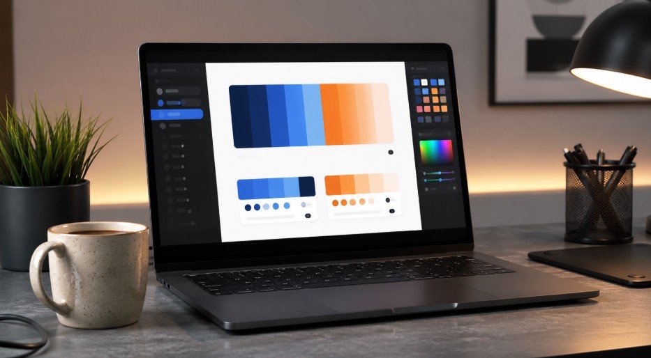
Sitting at my desk with a massive mug of coffee last week, a client asked me to make their brand-new homepage look professional yet somehow highly energetic. My mind instantly went blank because balancing those two distinct vibes using raw layout elements is an absolute nightmare if you do not have a clear visual roadmap.
Figuring out how to choose website color palette combinations that actually convert visitors into paying customers is the ultimate secret weapon in professional web design.
Key Takeaways
- Colors control user moods instantly.
- Balance everything with layout mathematical distribution.
- Always scale primary colors safely.
- Accessibility compliance protects your visitors.
- Plan for fluid background variations.
Missing This Design Step Will Ruin Conversion Rates
Let’s face it, launching a platform with a terrible color scheme is like wearing neon sweatpants to a luxury job interview. If you do not master how to choose website color palette combinations that actively guide the human eye, your visitors will hit the back button faster than you can say hex code.
Getting your UI palette right from day one saves your brand from painful redesigns and keeps your users happily scrolling through your pages.
Core Blueprint of Every Successful Interface Layout
Every gorgeous layout you love browsing follows a strict structural breakdown that stops it from looking like a chaotic mess. Most beginners make the mistake of picking five random beautiful shades and spreading them everywhere without a clear system.
Sixty Thirty Ten Rule for Layout Distribution
You need to train your eyes to see layouts in percentages if you want your interfaces to look incredibly clean. This mathematical distribution technique requires you to dedicate sixty percent of your digital canvas to your dominant background setting, thirty percent to your secondary structural blocks, and a tight ten percent to your high contrast accent elements.
Picking Your Dominant Base Canvas Setting

Your sixty percent dominant shade is typically your lightest neutral background tone which sets the macro atmosphere for the entire reader experience.
Using an off white or incredibly soft gray canvas keeps the environment feeling light and spacious while allowing your core content blocks to remain completely legible.
Mapping Out Secondary Elements and Structured Sidebars
Your thirty percent secondary tone works hard to support your background by defining the structural anatomy of your web page templates. You will use this color for card containers, navigation sidebars, and footer sections to give your users clear visual anchors as they scan downward.
Deploying Your Ten Percent Accent for Conversions
Your final ten percent is your most vibrant, eye catching shade reserved exclusively for things that matter. Lock this bold color down for your primary shopping carts, newsletter forms, and call to action buttons so they instantly jump out to a busy user.
The Secret Psychological Power of Screen Real Estate Colors
Different colors evoke different emotional responses from visitors when they first land on a layout. Matching your brand values to correct human emotional triggers is how you build a digital experience that feels instantly trustworthy.
Establishing Immediate Authority with Deep Blue Notes
Blue remains the absolute king of the digital corporate world because humans naturally associate it with security, stability, and high level professionalism. Tech giants, financial platforms, and medical institutions lean heavily on blue tones to put anxious users at complete ease.
Cultivating Organic Growth and Financial Health with Green
Green notes speak directly to feelings of natural freshness, massive wealth accumulation, and physical well being. This makes green an exceptional choice for modern environmental brands, personal finance tracking apps, and wellness platforms.
Creating High Urgency and Dynamic Action with Bold Red
Red is a hyper intense hue that accelerates the human heart rate and creates an immediate sense of energetic passion. E-commerce sites utilize red strategically for clearance countdown timers and flash sale banners to bypass analytical thinking and trigger fast purchases.
Radiating Creative Optimism Using Warm Yellow and Orange
Yellow and orange tones radiate pure solar energy, approachable warmth, and playful creative optimism. Food delivery platforms and creative agencies love these friendly shades because they make a brand look highly energetic and deeply accessible to the general public.
Learning how to design better Pinterest graphics can also show how warm color choices improve visual appeal, clickability, and brand consistency in social design layouts.
Choose Website Color Palette Patterns with Modern Software

Building a functional design system requires you to look far beyond basic color psychology charts. This simple breakdown will show you exactly how to choose website color palette systems that scale beautifully across every stylesheet you build.
Speeding Up Your Logic with Coolors Palette Generator
Instead of guessing hex codes in the dark, use the Coolors platform to quickly lock in your favorite brand shades and generate matching complementary hues. You can even upload your client logo directly into the software to automatically extract the core colors in seconds.
Analyzing Classical Harmonies on the Adobe Color Wheel
The Adobe Color interface allows you to experiment with deep mathematical color theory rules like monochromatic, analogous, and triadic relationships. It is an amazing professional workspace for discovering unexpected tone harmonies that are guaranteed to look balanced.
Generating Smooth Interface Gradients with Space UI Tools
Inputting a single base color choice into the MyColor. space tool will instantly generate massive design systems filled with matching user interface gradients. This gives you safe alternative options for subtle hover states and borders without breaking your primary brand identity.
Non-Negotiable Rules of Web Accessibility Compliance
A truly beautiful interface means absolutely nothing if a massive portion of your audience cannot comfortably read your content. True expertise in digital layout construction requires a deep commitment to universal user experience engineering.
Calculating Your Contrast Math for Flawless Text Legibility

The web content accessibility guidelines demand a strict color contrast ratio of four point five to one for all standard body copy. You must run your background and text combinations through digital contrast checkers to protect your readers from instant eye strain.
Selecting Smart Light and Dark Neutral Variations
Always include a rich charcoal gray for your primary typography and a clean off white for your main background styles. Avoiding stark pure black on pure white backgrounds prevents physical screen glare and keeps your reading experience incredibly smooth.
Frequently Asked Questions
1. What is the most reliable strategy regarding how to choose website color palette variations for a new business site?
The most reliable strategy regarding how to choose website color palette variations is combining the sixty thirty ten rule with high contrast neutrals. This ensures your layout remains clean, accessible, and optimized for conversions.
2. Which free online platforms help developers learn how to choose website color palette combinations without manual guesswork?
Platforms like Coolors, Adobe Color, and MyColor. space are fantastic free options that help you master how to choose website color palette combinations with automated generation tools.
3. Why does color contrast matter when figuring out how to choose website color palette assets for public platforms?
Contrast matters because your text copy must achieve a minimum four point five to one ratio to remain completely legible for visually impaired users and pass global web accessibility standards.
Level Up Your Design Game with Epic Tones
Nailing your digital layout look is all about blending creative artistic vision with solid mathematical structure. Once you start utilizing smart saturation scaling and locking down your accessibility contrast ratios, your interfaces will instantly look incredibly polished and professional.
Now that you know exactly how to choose website color palette systems properly, grab your favorite design tool and start building something truly epic today!