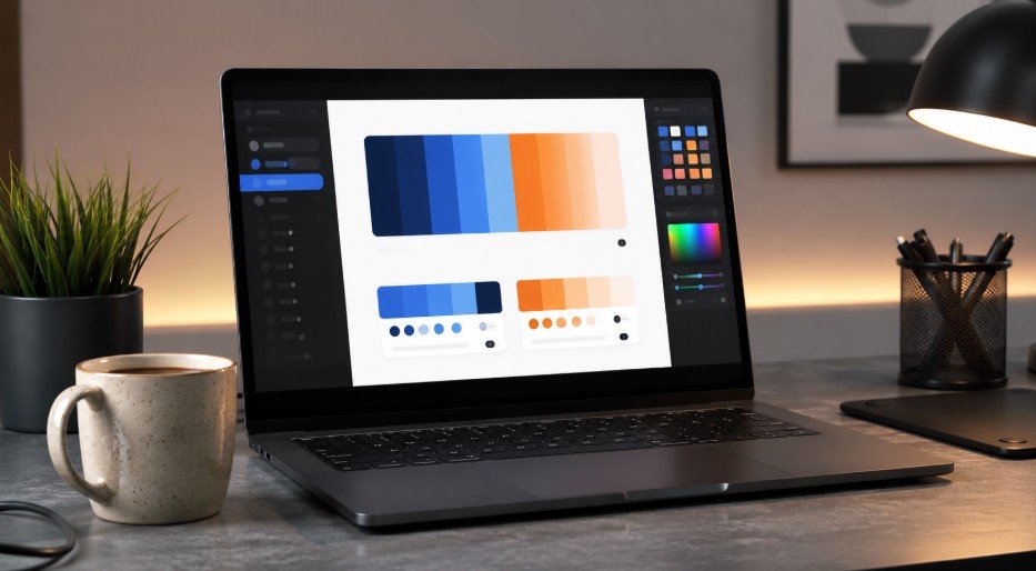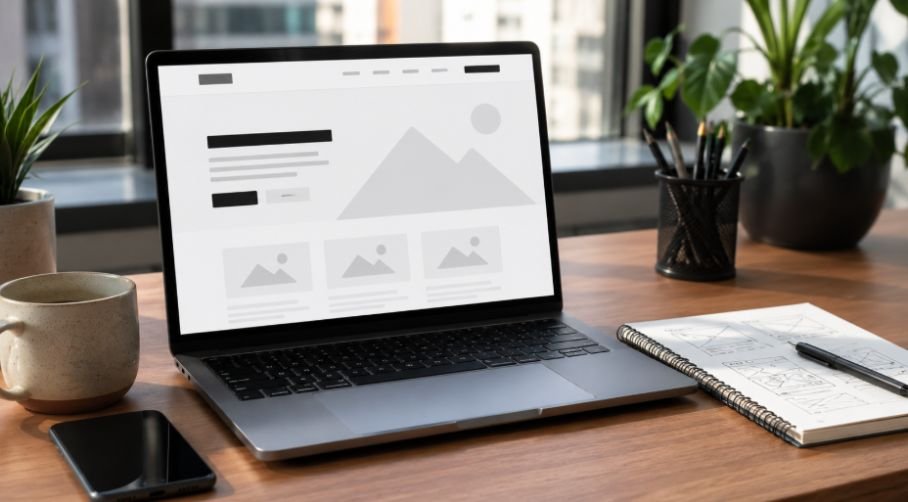


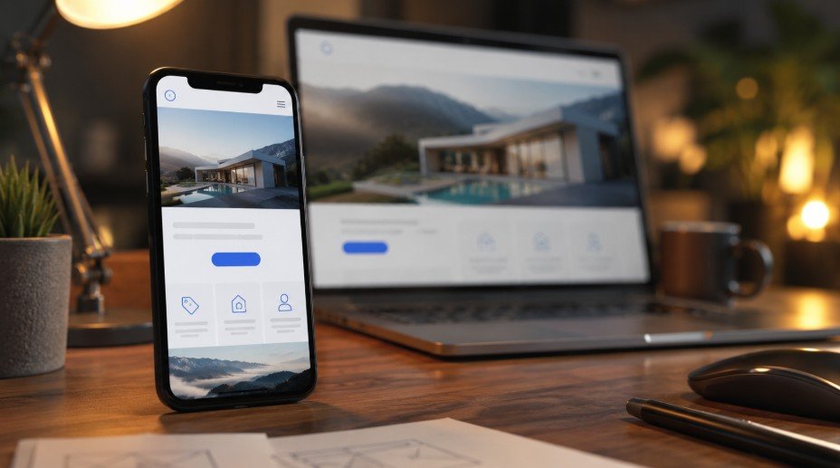
Designing a website that looks amazing on a desktop is a great feeling, but the real magic happens when that exact same layout fits beautifully into the palm of your hand. Navigating clumsy buttons on a tiny smartphone screen ruins the user experience instantly.
Mastering mobile friendly web design best practices ensures your visitors stay happy, engaged, and ready to explore your pages without getting frustrated.
Why Handheld Optimization Matters So Much
Picture your user squeezed onto a packed subway train, holding a warm latte in one hand and desperately trying to buy your product using only their thumb. If your desktop elements shrink into tiny, unreadable microscopic dots, that frustrated visitor will close your tab immediately and jump straight over to your competitor.
Delivering a smooth palm-sized experience is no longer just a nice secondary option, it is the absolute baseline requirement for surviving on the modern internet.
Structural Strategy and Adaptive Layouts
Setting up a fluid layout foundation is the very first step in crafting a successful responsive interface.
The Power of Fluid Grids
Building with rigid pixel layouts is a quick way to guarantee a broken user experience on smaller viewports. Implementing a truly fluid grid system allows your content to automatically scale, shift, and flow neatly across different device dimensions.
Following established guidelines from Google Search Central, this flexible approach keeps columns perfectly aligned whether viewed on a tiny screen or a massive display.
The Critical Viewport Meta Tag

Your browser needs explicit structural instructions to render your layout correctly on a handheld device. Always include the viewport meta tag inside your HTML header to prevent mobile web browsers from loading your pages at a wide, zoomed-out desktop width.
This simple line of code tells the device to scale the layout assets proportionally to match the physical width of the screen.
Smart Content Prioritization Techniques
Small screens mean limited vertical estate, making it essential to place high-value information and your primary action links directly above the fold. Utilizing collapsible design elements like accordions and neat tabbed areas helps hide secondary background content out of immediate sight.
This smart strategy significantly reduces endless vertical scrolling while keeping your main message front and center for the reader.
Human Interaction and Fluid Navigation
Fingers are much wider than a tiny desktop mouse cursor, so your interactive elements need to adapt to human hands.
Roomy Touch-Friendly Targets
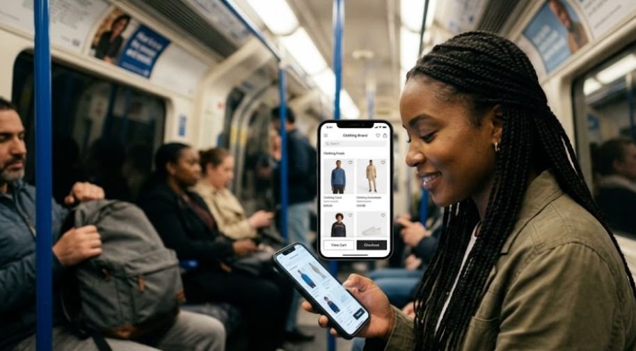
Accidentally clicking the wrong link because your layout blocks are crowded together causes instant irritation for web visitors. Designing interactive buttons and web forms with a minimum physical footprint of 44 by 44 pixels ensures clean clicks every single time.
Learning how to choose website color palette also helps you select button, background, and contrast colors that stay clear and easy to tap on smaller mobile screens.
Adding plenty of open padding around these active components aligns beautifully with Apple design guidelines and stops accidental misclicks entirely.
Streamlined Header Menus
Cluttered, wide desktop navigation bars quickly overwhelm small viewports and ruin clean visual presentation. Shifting to clean, space-saving solutions like the classic three-line hamburger menu button keeps your main links neatly tucked away until needed.
Keeping these slide-out lists short and adding a floating back to top button makes navigating deep pages incredibly smooth for your users.
Eliminating Desktop Hover Dependencies
Desktop interfaces rely heavily on hover states to show visitors that a graphic or text block is an active, clickable link. Because touchscreens cannot track a hovering finger, your handheld layouts must work intuitively using clear visual signs like underlines or bold icons.
Making all your elements instantly recognizable as links removes the guesswork and creates a natural, friction-free journey.
Typography Principles and Scannable Content
Your choice of fonts and paragraph layout can make or break reading comfort on a small screen.
Clean Legible Font Sizes
Forcing your web visitors to pinch and zoom just to read a paragraph of text destroys your overall engagement metrics.
Setting your base body typography to a minimum of 16 pixels ensures your copy remains instantly readable on any handheld screen. This simple adjustment protects eye comfort and encourages visitors to stay on your site much longer.
Comfortable Line Heights
Cramming lines of text tightly together creates a dense wall of words that is incredibly difficult to scan while on the move.
Maintaining a line height factor of at least 1.5 provides ample breathing room between your sentences for a comfortable reading rhythm. Understanding how to use white space in graphic design also helps you create cleaner mobile layouts with better spacing, easier scanning, and less visual clutter.
This structural openness makes absorbing information completely effortless on tight digital viewports.
Writing Short Scannable Paragraphs
Long blocks of dense text look incredibly overwhelming when squeezed into a narrow mobile column layout. Keeping your paragraphs brief and avoiding overly decorative, cursive, or ultra-thin font weights ensures clean rendering on high-density displays. Breaking up your text into quick chunks keeps the visual momentum moving forward smoothly.
Speed Tuning and Mobile Performance
A layout can look absolutely stunning, but it means nothing if the page takes too long to load on a cellular network.
Optimizing Heavy Media Assets

Massive photography files are the single biggest cause of slow loading speeds and high bounce rates on mobile web connections. Compressing your imagery and switching to modern, next-generation file formats like WebP or AVIF slashes download times significantly.
Limiting heavy animations further protects device battery life and keeps your system performing beautifully.
Implementing Lazy Loading Scripts
Downloading every single graphic on a long resource page all at once wastes precious cellular data and bogs down processing speeds. Setting up native lazy loading ensures that below-the-fold media assets only download when the user actively scrolls down to them.
This performance optimization technique saves processing power and allows your top header sections to load almost instantly.
Banishing Intrusive Mobile Pop-Ups
Giant full-screen overlays and intrusive marketing pop-ups are incredibly difficult to close on a tiny smartphone screen. These distracting elements frequently block the main text content, frustrate your audience, and can actively harm your overall search engine visibility.
Keeping your promotional banners small and non-intrusive preserves an uninterrupted, enjoyable reading experience.
Frequently Asked Questions
1. What are the best practices for mobile web design?
The absolute best practices focus heavily on implementing fluid grid frameworks, setting base typography sizes to at least 16 pixels, and designing large touch targets. You must prioritize your content layout to ensure your pages remain lightning-fast and exceptionally easy to navigate.
2. How to design a mobile-friendly website?
You can design a mobile-friendly website by adopting a strict mobile-first workflow, ensuring your layout code scales proportionally, and using percentage widths instead of rigid pixels. Simplifying your navigation menus into clean hamburger layouts keeps everything highly organized.
3. What are the 7 C’s of a website?
The 7 C’s are Context, Content, Community, Customization, Communication, Connection, and Commerce. When applying mobile friendly web design best practices, focusing on clean Context and streamlined Content ensures your site stays functional, clear, and highly interactive on smaller screens.
4. How to ensure a website is mobile-friendly?
You can ensure your website is mobile-friendly by testing your live pages across real smartphones, auditing your loading speeds, and checking for layout shifts. Verifying that your buttons have generous spacing prevents user frustration.
Ultimate Victory in the Palm of Your Hand
Mastering modern mobile friendly web design best practices comes down to respecting screen estate, optimizing your images, and keeping your layouts completely fluid. When you focus heavily on speed and touch-friendly interactions, your pages load instantly and feel completely natural to use. Stick to these core web design guidelines, keep your structures beautifully simple, and watch your mobile engagement soar.