

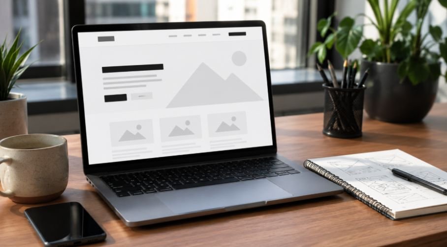
Walking into a beautifully organized boutique feels amazing, while entering a cluttered store makes you want to turn around immediately. Your digital storefront works exactly the same way, and learning how to design a homepage layout is your ticket to making people want to stay.
Let’s make sure your corner of the web looks like a welcoming boutique instead of a chaotic bargain bin.
Obsessing Over Your Front Page Layout
Think of your website as a digital blind date where you only have seconds to impress. If your layout looks like a digital explosion at a garage sale, visitors will swipe left on your business faster than you can say click.
Learning how to design a homepage layout turns that awkward first greeting into a warm welcome that instantly builds trust and convinces people to stick around.
The Header and Navigation Blueprint
Every stunning website you love follows a hidden structural pattern that keeps your eyes glued to the screen. Setting up a familiar navigation system at the absolute top of your page is the secret weapon of pro web designers.
Placing Your Logo to Ground Your Brand
People naturally read digital screens from left to right, making the top left corner the prime spot for your logo. Keeping your branding anchored in this familiar position helps visitors immediately identify where they are.
When your logo sits comfortably in its expected home, it creates an instant sense of security and professionalism.
Minimal Menus for Maximum Clarity
Streamlining your primary menu by limiting it to three or five essential links keeps users from feeling overwhelmed. Use simple, descriptive labels that leave zero mystery about where a link will take the browser.
When you reduce the number of choices, visitors can find their way around your site without any confusion.
The High Contrast Action Button
Placing a prominent call to action button in the top right corner gives your visitors a clear next step. Make sure this button uses a bold color that pops out against the rest of your header background. This simple addition ensures that ready to buy customers never have to hunt for a way to contact you.
The Hero Section Masterclass
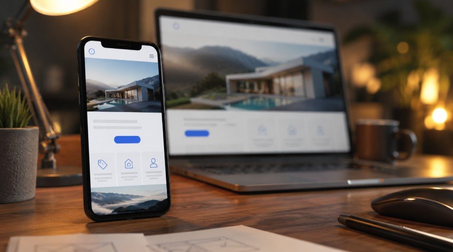
The area of your page that loads before a user scrolls is the absolute most critical real estate on your site. Following mobile friendly web design best practices ensures this hero section stays clear, fast, and easy to read on smaller screens.
This section must answer three burning questions about your business in a matter of two or three seconds.
Defining Who You Are Instantly
Your hero section needs to state your business identity clearly without making people guess. Use a clean, bold layout that frames your company name or core identifier beautifully against a calm background. When a user arrives, they should know exactly whose digital home they are visiting within a single glance.
Stating Your Core Value Proposition
Craft a powerful headline that explains what you do and how your business makes your customer’s life easier. Avoid using confusing industry jargon or overly clever metaphors that force the reader to think too hard. Speak directly to the biggest benefit you offer so the reader immediately understands your worth.
Solving the Practical Pain Point
Follow your main headline with a short, helpful subheadline that explains exactly how you plan to help the visitor. This tiny block of text serves as the bridge that connects your main offer to the user’s specific problem. Pair this text with an authentic, high-quality visual that supports your message and drives the point home.
Showcasing Products and Solutions
Directly beneath your hero section is the perfect place to introduce what your business actually sells. Stacking your primary offers in a logical sequence keeps your visitors moving smoothly down the conversion funnel.
The Clean Three Column Grid
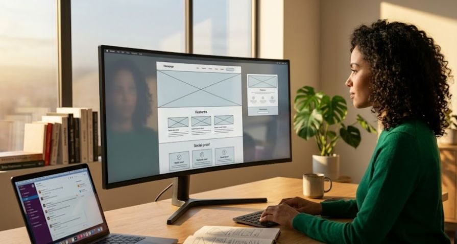
Organizing your primary products or services into a balanced three column grid makes your offers incredibly easy to digest. This classic layout lets you showcase multiple options side by side without cluttering up the screen.
Each column should feature a crisp icon or image alongside a brief, punchy description of the service.
Highlighting the Perfect Fix
Dedicate this part of your homepage layout to showing how your specific solutions wipe away your client’s headaches. Frame your product descriptions around the ultimate results your users will experience after buying from you.
When you focus on benefits instead of just listing boring features, your offer becomes much more tempting.
Guiding the Eyes with Balanced Spacing
Give each product block plenty of breathing room by surrounding your text and images with generous whitespace.
Leaving ample open space prevents your product section from looking like an unorganized digital catalog. Clean spacing naturally draws the eye toward your text and makes the entire browsing experience feel premium.
Leveraging Social Proof and Trust
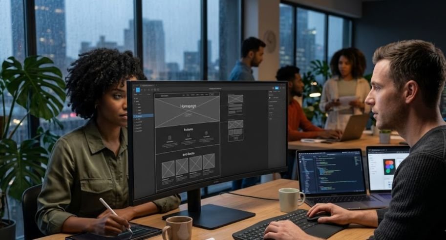
Building deep credibility is essential before you ask your website visitors to make a final purchasing decision.
Showing off real success stories shifts the focus from what you say you can do to what you have already proven you can do.
Spotlighting Glowing Client Reviews
Dedicate a clean, beautifully formatted section of your layout to displaying authentic words from your happiest customers.
Use short, impactful quotes that highlight the specific ways your business delivered incredible results. Including a real name or a small photo next to the text adds a layer of honesty that copy alone cannot replicate.
Displaying Authority Logos
If your business has collaborated with recognizable brands or received industry awards, put those logos on display. Lining up these familiar symbols acts like a digital stamp of approval that instantly lowers the guard of skeptical browsers.
Keep these logos in a subtle, monochromatic style so they blend beautifully with your overall design scheme.
Building Integrity Through Real Faces
Ditch the generic stock photos of smiling models and use real images of your team and actual clients instead. People connect with real human beings, and showing the actual faces behind your brand builds immense trust. Authentic visuals prove that your business is legitimate, transparent, and ready to serve.
The Footer and Final Call to Action
Wrap up your entire page layout with an intentional conclusion that serves as a safety net for curious wanderers. This bottom section ensures that users who scroll all the way down are met with a professional, polished finish.
The Ultimate Last Chance Catchment
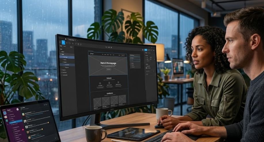
Place one final, compelling call to action block right above your footer to catch readers who are ready to take action. This section should feature a direct contact form or a bold button that mirrors your top hero offer. It saves your users from having to scroll all the way back to the top just to get started.
Organizing Your Digital Directory
Your actual footer should house a clean visual sitemap that helps users navigate to secondary pages like your blog or about section. Group these links into neat, vertical columns so they look organized and are easy to read. This keeps your main header clean while still giving deep divers access to all your content.
Polishing off the Legal Basics
Use the absolute bottom of your page to display your copyright data, social media links, and privacy policies. This standard practice reassures your visitors that your website follows modern legal guidelines and internet standards. It adds a final touch of professionalism that wraps up the user experience beautifully.
Frequently Asked Questions
1. What is the 3 second rule in website design?
The three second rule states that you have exactly three seconds to capture a visitor’s attention. Your homepage layout must explain what you offer and how to take action within this tiny window, or users will bounce.
2. How do I create my own homepage?
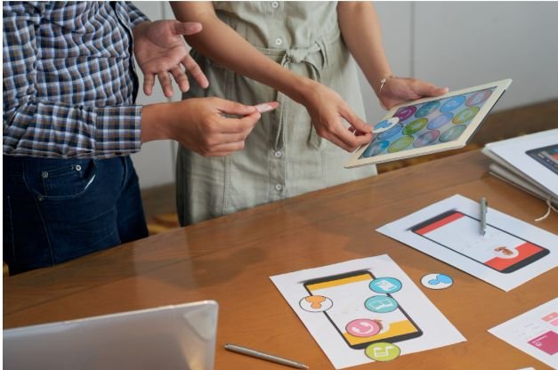
Start by mapping out a simple wireframe skeleton on paper to outline your content flow. Pick a flexible website platform, choose a responsive template, and customize it using your brand colors, simple fonts, and authentic imagery.
3. What is the best layout for a homepage?
The best layout is a clean, single column structure that utilizes predictable navigation patterns. Keeping your design simple preserves the mental models of your users and lets them focus entirely on your unique brand message.
4. What are the 7 C’s of website design?
The seven C’s stand for context, content, community, customization, communication, connection, and commerce. Balancing these foundational pillars ensures your website layout delivers an exceptional user experience while driving consistent, measurable business growth.
High Five Your Brand New Homepage Layout
Mastering how to design a homepage layout is the absolute ultimate game changer for your online presence. Prioritizing clean visual hierarchy, ample whitespace, and crystal clear navigation transforms your site from a quiet digital brochure into an active sales engine. Keep your user’s experience at the center of every layout choice you make, and watch your brand engagement soar to exciting new heights.