

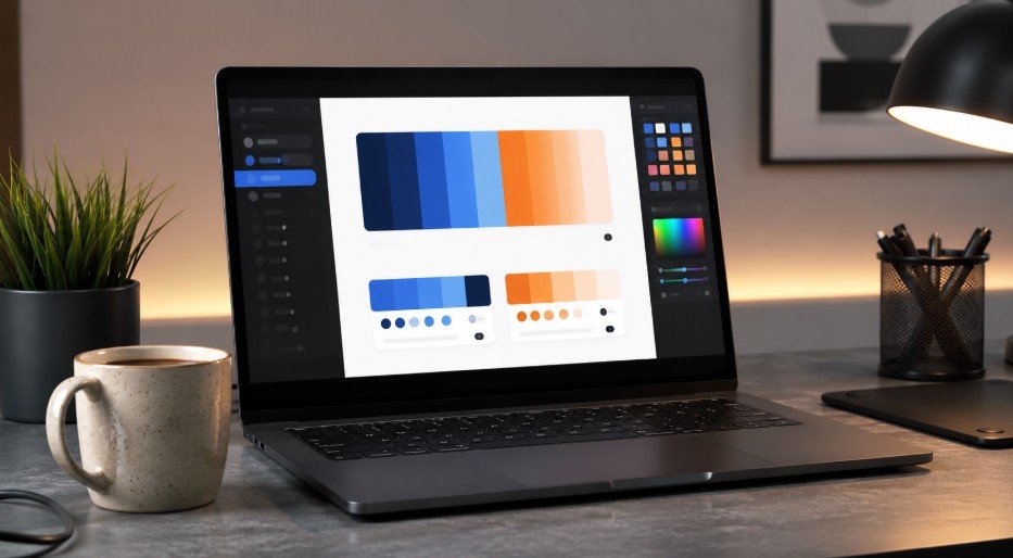


Graphic design rules every creator should know are not about making every design look the same. They are about making your work easier to read, easier to trust, and harder to ignore. I learned this the practical way: the design that looks “creative” in the editor can still fail if the viewer does not know where to look first.
Why Design Rules Matter Before Style
A stylish visual can still feel messy when the structure is weak. Good design starts with order, not decoration. The strongest creators use hierarchy, spacing, alignment, contrast, typography, and color control before adding effects.
Nielsen Norman Group explains that visual hierarchy helps people decide where to look by using size, color, proximity, and grouping. That matters because viewers scan before they read. If your design does not guide them fast, they move on.
Build a Clear Visual Hierarchy

Visual hierarchy decides what the viewer sees first, second, and third. Without it, every element competes for attention.
Make One Element the Star
Every graphic needs one dominant focal point. It could be a headline, product photo, number, quote, icon, or call-to-action. I usually ask one question before exporting: “What would someone remember after three seconds?”
If the answer is unclear, the design needs stronger hierarchy. Increase the headline size, simplify the background, or give the main element more space.
Shrink Supporting Details
Dates, captions, addresses, disclaimers, and extra notes should support the main idea. They should not fight with it. A common beginner mistake is making everything large because everything feels important.
That creates visual noise. Instead, rank content by value. The most important message gets the most weight. Secondary details stay smaller, quieter, and cleaner.
Use Typography With Restraint
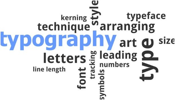
Typography can make a design look premium or instantly amateur. The best rule is simple: use fewer fonts and make them work harder.
Limit Fonts and Protect Readability
Two fonts are usually enough. Use one font for headings and another for body text. A bold serif with a clean sans-serif can work well, but only if the contrast feels intentional.
For social posts, blog graphics, posters, and thumbnails, readability should come before personality. Decorative fonts may look beautiful, but they often fail at small sizes.
If your main issue is unclear lettering, learn to make text readable on graphics before finalizing your layout.
Never Stretch Type
Never drag text sideways or vertically to “fit” a space. It distorts letterforms and makes the design look cheap. Scale text proportionally instead. Adjust font size, line breaks, tracking, or layout width.
I also avoid using more than three text weights in one design. Too many weights create the same problem as too many fonts.
Align Everything With a Grid
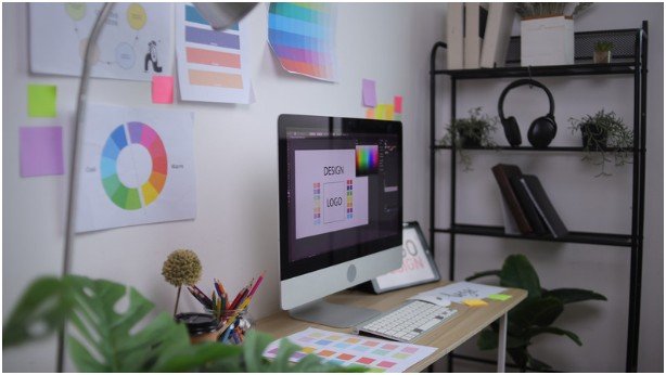
Alignment is one of the fastest ways to make a graphic look professional. When text, images, icons, and shapes line up, the design feels intentional.
A grid does not need to be complex. Even a simple two-column or three-column structure can organize the entire canvas.
Use Proximity to Group Ideas
Related items should sit close together. Unrelated items need more space between them. This helps the brain understand what belongs together.
For example, a sale graphic should keep the discount, product name, and CTA in a clear group. If the price floats far away, the viewer has to work harder.
Try the Rule of Thirds
The Rule of Thirds divides your canvas into a 3×3 grid. Placing key elements near the intersections can make layouts feel more natural and dynamic.
I use it when a centered design feels too flat. Moving the focal point slightly off-center often creates more energy without making the graphic messy.
Make Contrast Do the Heavy Lifting
Contrast is not only about color. It also includes size, weight, spacing, shape, and texture. Strong contrast tells the viewer what matters.
Check Text Before You Publish
The Web Content Accessibility Guidelines recommend a contrast ratio of at least 4.5:1 for normal text and 3:1 for large text. This helps users with low vision read content more easily.
That means pale gray text on white, yellow text on light backgrounds, and thin fonts over busy images are risky choices. Adobe also offers contrast tools that help creators test foreground and background color combinations.
A simple test works well: zoom out or squint. If the headline disappears, the contrast is too weak.
Give White Space a Real Job
White space is not wasted space. It is the breathing room that makes important content feel premium.
Crowded designs often happen when creators try to fill every corner. I used to do this with icons, patterns, shadows, and extra labels. The result looked busy, not better.
Use white space around headlines, product images, and calls-to-action. It separates ideas and makes the main message easier to process.
Keep Color Palettes Simple

A strong color palette does not need ten colors. Most clean designs use one to three primary colors and a few accents.
Start in grayscale when the layout feels confusing. If the design works without color, the structure is strong. Then add color to create mood, emphasis, and brand recognition.
Complementary colors can create energy. Analogous colors can create calm. But too many colors weaken focus. If everything is bright, nothing feels important.
My Quick Design Check Before Exporting
Before I publish any graphic, I use a short practical test.
First, I check the three-second message. If I cannot understand the main point quickly, I simplify the layout.
Second, I check alignment. Every major object should connect to a grid, margin, or visual edge.
Third, I check contrast. Text must stay readable on desktop and mobile.
Fourth, I remove one unnecessary element. This small habit improves almost every design.
These graphic design rules every creator should know work because they reduce confusion. They help the viewer understand the message before judging the style.
FAQs
1. What are the most important graphic design rules for beginners?
Start with hierarchy, alignment, contrast, white space, simple typography, and limited colors.
2. How many fonts should I use in one design?
Use two fonts when possible and three at most for clean, professional visuals.
3. Why is contrast important in graphic design?
Contrast improves readability, directs attention, and helps key elements stand out quickly.
4. How do I apply graphic design rules every creator should know to social media posts?
Use one focal point, readable text, strong contrast, consistent margins, and a simple color palette.
Final Touch: Make It Look Effortless
Good design should not make people work. It should guide them smoothly from the main idea to the next action. The sassiest truth is this: if your design needs an explanation, it probably needs editing.
Start with hierarchy. Clean up the type. Align the layout. Strengthen the contrast. Give the design room to breathe. Then remove anything that is only there because you were afraid of empty space.