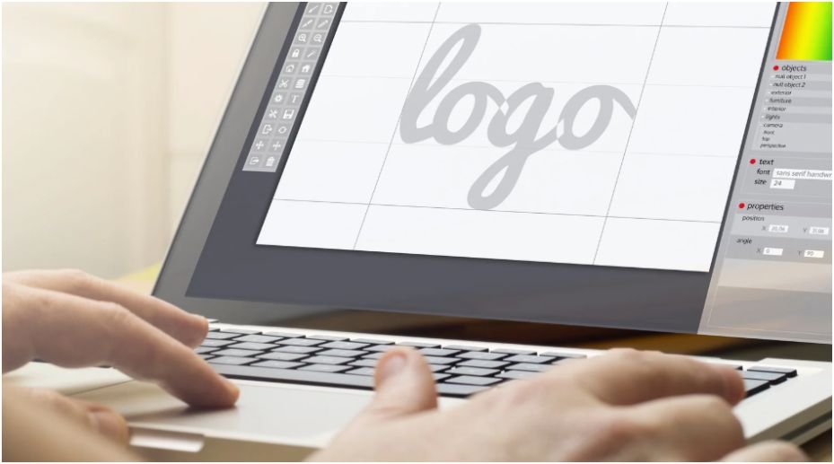



Remember sitting staring at a completely blank screen, wishing a gorgeous website would just magically assemble itself? We have all been there, feeling completely overwhelmed trying to figure out where the buttons should go, which colors actually match, and how to make the entire thing look clean.
Mastering the basic concept of web design does not require a fancy art degree or years of computer coding knowledge, it simply takes a solid grasp of how everyday people look at screens. Getting these fundamentals right changes your creative work from an amateur amateur project into a professional, high-converting digital product that people love to browse.
Key Takeaways
- Clear layout hierarchies guide the human eye naturally.
- Mobile scaling prevents frustrating desktop navigation breaks.
- Restrained color choices protect visitors from visual fatigue.
- Smart typography setups boost your overall content readability.
- Design software blueprints make engineering transitions seamless.
Why You Need This Digital Secret Weapon
Why bother learning the basic concept of web design instead of picking a random template? Because a poorly structured site scares away your visitors faster than a slow internet connection.
Understanding these layout rules saves you from launching an ugly digital ghost town, ensuring your platform converts random clicks into loyal fans immediately.
web design tips for small businesses can also help beginners apply these fundamentals in a practical way when building sites for real brands.
User Experience and Information Architecture
Mapping out a website architecture requires careful planning before you ever touch a single color palette or graphic. Information architecture ensures that your visitors can discover important information naturally without getting lost in a maze of broken links.
Structural Site Maps

A structural site map acts as a birds eye view diagram that shows how different pages connect to one another. Creating this visual map helps you organize your navigation links logically so your audience finds exactly what they want within three quick clicks.
Low Fidelity Wireframes
A low fidelity wireframe serves as a skeletal blueprint outlining the basic structure of a page without colors or decorative fonts.
Sketching these simple layouts dictates strategic content placement and guides the natural flow of your user journey. design web layouts in Photoshop can help you turn these early wireframe ideas into polished page mockups before development begins.
Dynamic Responsive Design
Websites must adapt seamlessly across desktop computer setups, portable tablets, and small mobile smartphone screens. Designing with fluid percentage grids ensures that your images and text blocks scale down smoothly without breaking your structural layout.
Core Visual Principles
Web creation uses fundamental art and communication rules to guide the human eye and reinforce your core brand message. Balancing your visual elements properly prevents a layout from looking cluttered while building immediate professional authority.
Strategic Visual Hierarchy
Visual hierarchy is the deliberate arrangement of your layout elements based on their true level of importance. Important focal elements like headline blocks and primary action buttons should always be styled larger and bolder than standard body text.
High Contrast Frameworks
Using distinct differences in size, color, or shape allows you to draw instant human attention and guarantee absolute readability. Setting dark text against clean light backgrounds protects your audience from experiencing annoying visual fatigue while scanning your content.
Neat Balance and Alignment

Neatly aligning your elements prevents a live webpage from feeling disorganized and builds deep consumer trust. Using a strict grid system keeps your margins consistent, giving your creative project a polished finish that mirrors high end tech platforms.
Proximity and Spatial Grouping
Grouping related items together helps human users naturally process digital information without feeling confused. Keeping a clickable action button directly below its corresponding text description tells the brain that those two separate items belong to the same functional concept.
Typography and Color
Good typography and color choices guide how users feel and interact with your brand on a deeply psychological level. Selecting your creative assets with intentional restraint keeps your entire interface cohesive, clean, and highly memorable.
Establishing Readable Typography
Limit your project to two or three clean fonts to maintain a highly readable structure across your entire site. Stick to clear H1 main headers, H2 subheadings, and paragraph body copy to establish a predictable reading order for your visitors.
Applying Color Theory
Colors evoke specific emotions within your audience and should always align seamlessly with your overarching brand identity. Use vibrant contrasting pop colors to make your primary clickable buttons stand out cleanly from your neutral background shades.
How to Apply the Basic Concept of Web Design

Launching a high performing website requires a step by step workflow that bridges the gap between creative visual concepts and live functional code. Following a systematic approach keeps your production pipeline organized and eliminates costly design mistakes before launch.
First, define the core purpose of your platform and sketch out low fidelity wireframes to lock in your content placement and spatial architecture.
Next, apply your typographic hierarchy and your minimalist color theme, ensuring your layout leaves plenty of breathing room for easy scanning.
Finally, build your fluid layout structures inside an engineering tool, testing the live responsiveness across multiple physical mobile screens to confirm every button is easy to click.
Frequently Asked Questions
1. What is the basic concept of web design?
The basic concept of web design involves the strategic planning and arranging of digital content to create beautiful, functional websites. It blends visual graphics with user usability rules to ensure online information remains accessible and engaging across all modern device screens.
2. What are the 5 basic principles of web design?
The five fundamental pillars are visual hierarchy, contrast, balance, proximity, and white space. Mastering these essential rules allows creators to control user attention, improve text readability, and guide visitors toward primary call to action buttons effortlessly.
3. What are the 7 principles of web design?
This expanded design framework focuses on balance, contrast, emphasis, unity, scale, repetition, and harmony. Combining these seven concepts ensures that every graphic element on your webpage feels unified, professional, and properly aligned with your brand identity.
4. What are the 7 C’s of website design?
The 7 C’s are context, content, community, customization, communication, connection, and commerce. Balancing these strategic business elements guarantees that your website serves a functional purpose while delivering an intuitive user experience for your target audience.
Ignite Your Next Big Digital Masterpiece
Embracing the basic concept of web design grants you the power to shape how the world experiences your digital brand. Focus on mastering clean structural layouts, keeping your text highly readable, and perfecting your mobile scaling. Keep refining your skills, trust the creative process, and go build a website that you are genuinely thrilled to launch!